
Hiding Joomla modules on mobile devices
23 Sep 2011 - Written by Anthony Olsen
Posted in Tutorials

It always feels a little bit like cheating to use display: none in any css declaration, but its such an easy and useful tool that sometimes it's the best (read easiest) way to add some flexibility to the way certain content gets displayed on the page.
As you are probably already aware, the Joomla module class suffix system is a seriously powerful system and in my opinion really underpins Joomla templating and opens up a world of flexibility and configuration for the end user.
The following is a really simple hack that allows you to hide certain modules on small screens using the magic of media queries combined with a module class suffix.
The CSS
The following css can be added to any css file that gets included on the page. In the Zen Grid Framework you can add it to the css/theme.css file or in the default Joomla templates css/template_css.css file.
{codecitation}
/* Mobile Portrait Size to Mobile Landscape Size (devices and browsers) */
@media only screen and (max-width: 480px) { .moduletable.mobilehide {display:none}
}
{/codecitation}
Note that the .mobilehide part of the css rule above is a class and does not attach directly to the moduletable statement. This is important as it means that we can keep the use of the module in question flexible and not necessarily tether the module to the .mobilehide class in other non mobile contexts.
This means that the .moduletable.mobileclass gets picked up properly and renders as another class in the html:
{codecitation}
Without the space the module class will render like this
{codecitation}
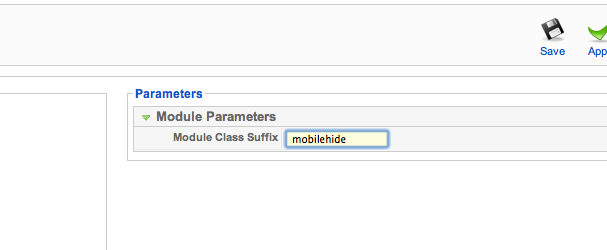
Adding the module class.
The next part is to go to the module you want to hide on small screens and add the module class: " mobilehide". You don't need to add the quotation marks but I have done so to highlight the space preceding the mobilehide text.
Testing the result
So when we implement the changes to the css and then apply the module class suffix to our targetted module we get a module that displays on all screens larger than 480px and is hidden on screens smaller than 480px.
This is really more of a hack in that the content of the module still gets loaded on small screens and mobile devices but depending on the content itself this won't have too many consequences. If the module you want to hide carries content that will significantly impair the loading time on a mobiel device then you may need to iomplement a different solution for hiding modules on mobiel browsers.
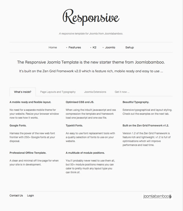
On larger screens.
In the example below I applied the modulehide suffix to the banner slogan with the text that reads "The Responsive Joomla Templates is the new ...". On the screen resolutions larger than 480px it display normally with no change to the appearance.
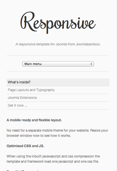
On smaller screens.
As you can see from the grab below the slogan has been hidden on the smaller screen however the rest of the page remains intact.
There may be a more elegant solution to hiding content from mobile devices but I think this is by far the easiest to implement. This feature will be implemented as a standard part of the next version of the Zen Grid Framework along with a few other handy tools for targetting mobile sized browers.
Look out for the next version of the framework which should be due out in the next week or so.
blog comments powered by Disqus