A quick peek at the Intrepid Joomla template
09 May 2012 - Written by Anthony Olsen
Posted in Joomla Templates

A few days a go I dribbbled some screenshots of our next Joomla template which is due for release in the next few weeks. I really wanted to push a rich, corporate colour pallette on this one as well as play around with some noticeably different responsive layouts.
I've seen some comment that responsive design isn't applicable for complex or intricate layouts. The more I work with responsive design I think that pretty much anything is possible. Of course it helps to have a nice responsive framework to sit underneath the design, but at this point, (and I might be proved wrong at some point) I think that most perceived limitations are self-imposed.
Checkout the screenshots of the design below and let us know what you think. Not all of the details have been filled in (or finalised) but you can get the picture. Also the logo is just a little placeholder for the time being.
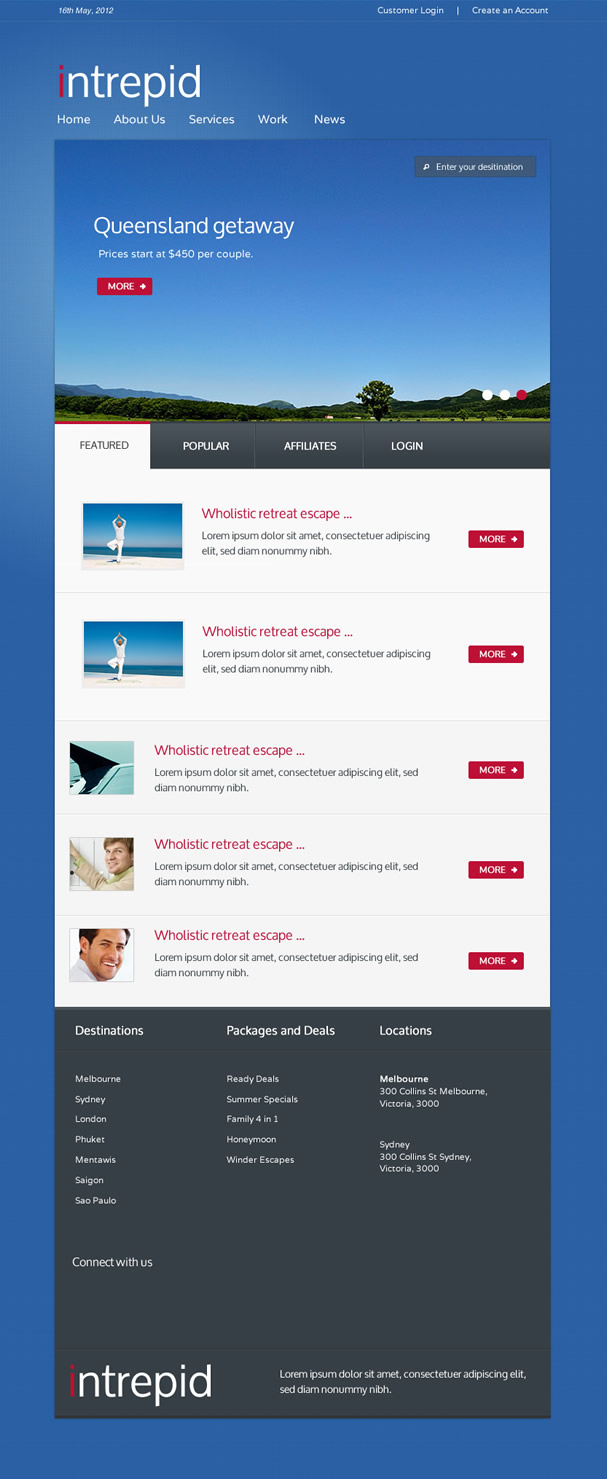
Thin browsers
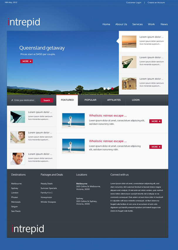
Mid-sized browsers
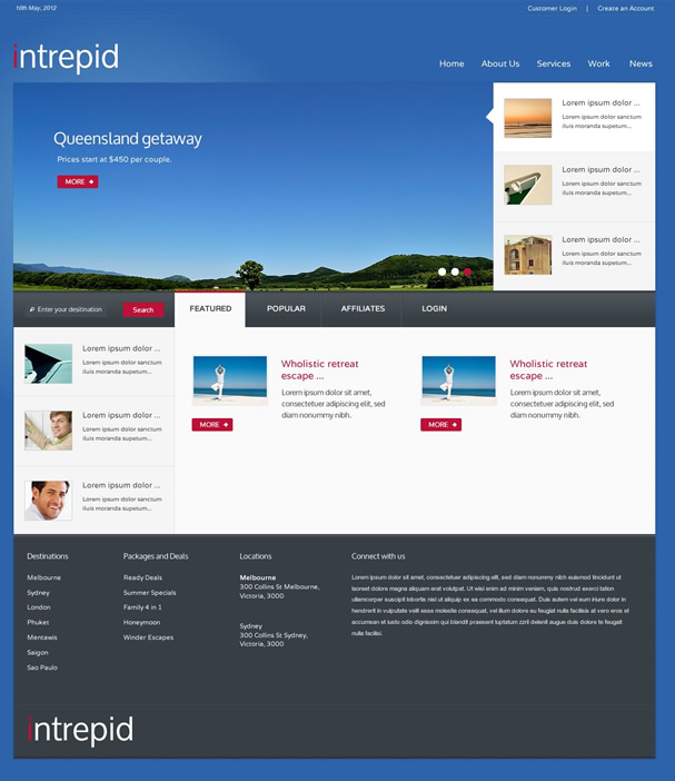
Wider Browsers
Still building this view out a bit but it's designed for wider screens circa 1200px.