Colours in Web Design - Red
18 Feb 2010 - Written by Barbara Rudlin
Posted in Bamboo Blog
Just why do we respond in the same way to certain colours? This is not entirely due to exposure to their use in familiar ways, some part comes from deep inside and a large part of this is what is taught to us as children about the meaning of colour.
This is the first in a series of articles looking at the meaning and emotion behind some of the more widely used colours from the vast array available at designers’ fingertips.
So just what is the colour red trying to tell us?
Red is the colour of fire and blood, so it is traditionally associated with energy, war, danger, strength, power, determination as well as passion, desire, and love.
Red is a very emotionally intense colour, it can have a measurable effect on the human body, enhancing human metabolism, increasing respiration rate, and raising blood pressure.
It has very high visibility, which is why warning signs, traffic lights, and fire equipment are usually painted red. In heraldry, red is used to indicate courage. It is a colour found in many national flags.
Red in Web Design
Red brings text and images to the foreground. Use it as an accent colour to stimulate people to make quick decisions; it could be considered the perfect colour for 'Buy Now' or 'Click Here' buttons on Internet banners and websites.
However do not forget the aggressive nature of the colour so a different shade may be more appropriate. In addition red is more often used to highlight error messages when a user mistypes or miss-clicks whilst navigating, or to highlight required fields when used with an on-line form.
In advertising, red is often used to evoke erotic feelings (red lips, red nails, red-light districts, 'Lady in Red', etc). Red is widely used to indicate danger (high voltage signs, traffic lights). This colour is also commonly associated with energy, so it could be used when promoting energy drinks, games, cars, items related to sports and high physical activity.
The various shade also have different triggers associated:
Light red represents joy, sexuality, passion, sensitivity, and love.
Pink signifies romance, love, and friendship. It denotes feminine qualities and passiveness.
Dark red is associated with vigour, willpower, rage, anger, leadership, courage, longing, malice, and wrath.
Brown suggests stability and denotes masculine qualities.
Reddish-brown is associated with harvest and fall.
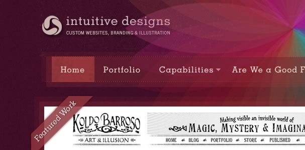
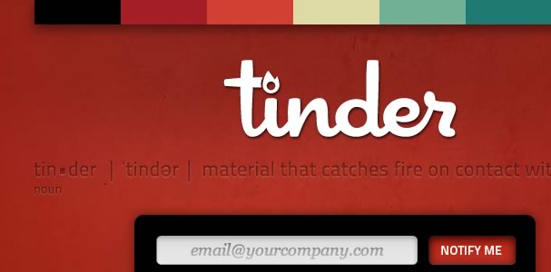
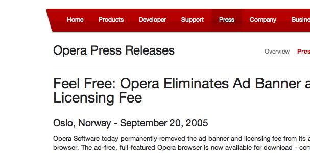
To demonstrate the various ways Red can be used in web design I have collated a few beautiful and visually impressive sites. The following examples vary the degree to which they use of the colour red - rich full pallets, clean minimal highlights, red textures and small splashes of red on an otherwise dark or complementary colour scheme.
Flexible CSS
Intuitive Designs
Rotondo
Tinder
Kyle Haskins
Cafe Rouge
Crimson Publishing
Billy Tamplin
Erica Works
Nine Lion
Opera
Super Hair
Webfeat
YShout5
Hopefully this will have provided you with some inspiration and insight when next selecting your colour scheme.
blog comments powered by Disqus


