Media queries for Joomla templates - Part One
09 Sep 2011 - Written by Anthony Olsen
Posted in Bamboo Blog
I have been spending a lot of my time lately, while doing design research for Joomla templates, checking to see if the website I'm viewing scales according to the browser size. I think I'm addicted to seeing the design morph and unfold as I move the browser window back and forth. I love the power of media queries.
If I'm honest I get a little disappointed when I see an awesome design that doesn't scale to match browser width these days. (Oh before you try, this design will not scale but I have a redesign in the works that will make use of media queries.)
What are media queries?
If you are new to media queries or responsive web design, in a nutshell it's a way of serving up css to your visitor that targets specific browser widths and scales the site according to the device or screen resolution that they are viewing the site with.
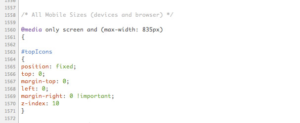
The screen grab below shows some code highlighting how the #topIcons element should display on screens less than 835px wide.
I much prefer this way of targetting mobile devices rather than the alternative, which is serving up a completely fresh template or theme, as it helps to keep the end user connected to the "real" website at all times. I've mentioned before that I get turned off having to click on a link to view the full site and somehow, psychologically, I feel like I am not getting everything the site has to offer when I see the little link at the bottom of the page that says "view full site". I understand why you would do that but that's my knee jerk, biased and emotional reaction.
Also there are very few mobile only designs that I can sincerely say I have been impressed with from a design point of view. Sure they are functional and work well on a mobile device but are they beautiful? Usuability should always trump aesthetics but at the same time why not try and achieve both?
Examples of sites that use media queries.
This post is the first in a series focussing on implementing media queries in Joomla templates. But before we get started on the technical nitty gritty I thought I would tempt you with some examples of some beautiful websites that implement media queries in their designs. Who knows, after viewing the designs below perhaps you'll become consumed by media queries and start obsessively resizing your browser window to see what the design will do.
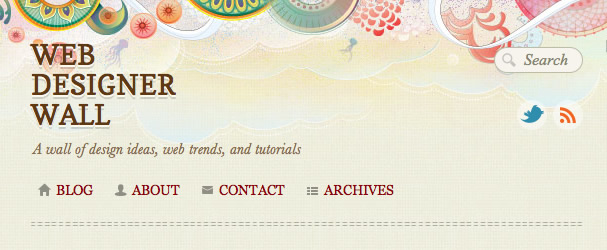
Web Designer Wall
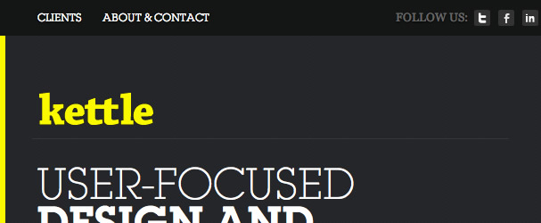
Kettle
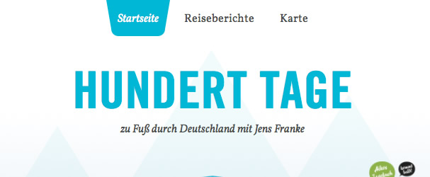
HundertTag
Twit Justice
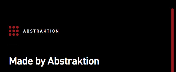
Abstraktion
Duet

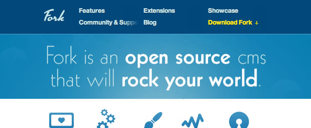
Fork CMS
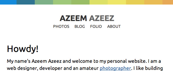
Azeem Azeez
Think Vitamin

Fuzzco

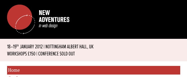
New adventures in web design
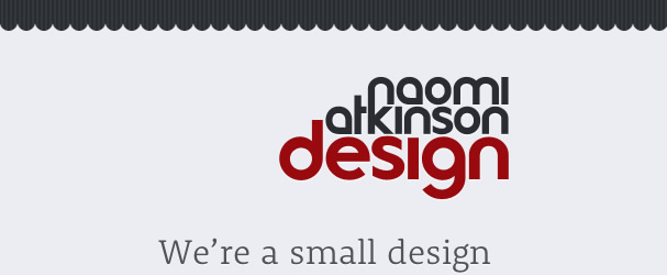
Naomi Atkinson
Pat Dryburgh
Lefft

Food Sense
Andy Rutledge
Facts.regu.la