
Things to love about Joomla 3.0 - Part One
09 Oct 2012 - Written by Anthony Olsen
Posted in Joomla 3.0

The more I dig into Joomla 3.0 the more I love this new version of Joomla.
Rather than compiling all of these things into a single ten things about Joomla 3.0 type post, I'm going to start a new series of microblogs around Joomla 3.0. It's easy enough to read the specs on the Joomla 3.0 landing page, but how do these new features bear out when you are actually using them?
Using Joomla 3.0 in the real world.
I've just spent the last hour or so preparing the sample data that we use for our Joomla templates and in that time I've found a new appreciation for the work that the Joomla 3 UX team have put into revamping our much loved CMS.
While I think that, in general, there could be a little more visual hierarchy employed in the interface - I'm sure that will come as the 3 series develops - there are some things that are simply 1000% better than the preceeding versions of Joomla.
Selecting a menu type is number one on my list.
Menu type options in Joomla 1.5
I actually don't mind the way that this is displayed in Joomla 1.5. Sure it's a little dated and you have to wait for the page to load when you click on each parent category, but visually it makes sense and helps the user to see the various menu options in context.
The main issue with this layout was when you started to add multiple extensions. As soon as you start to add two, three, four or even more new components you add significantly to the list of menu options and consequently start to reduce the readability of the list.
The other element that could have been improved in the Joomla 1.5 display is that the tree and the interface elements are a little small. While it is possible to follow the active parent and its child items relatively easily through the tree, when I scan the list as a whole, it still takes me a little time to come to terms with all of the options.

Menu type options in Joomla 2.5
Even though this should make sense it's one part of the menu creation process in Joomla 2.5 that I found challenging.
A two column list shouldn't really be that difficult to use, but in terms of my work flow this is a place that I often got caught up. Even if the disruption is just for a few seconds it's still a significant disruption when performing a routine task.
This screen could have probably been improved with a little bit of styling. However if you start to add more space to the list elements, then the modal window starts to get cramped and as you can see, even in a close to default setup of Joomla 2.5, we are already starting to see scrollbars.

Menu type options in Joomla 3.0
So enter the Joomla 3.0 way of doing things.
What I love about the Joomla 3.0 display is the clear sense of hierarchy. While it borrows on the tree structure of Joomla 1.5, the nested elements are clearly differentiated from the parent and the subsequent parent items are also separated from the preceeding open list of menu options.
This in my opinion makes the list of options much easier to scan through and because of the space and borders given to the parent items I can quickly jump from one to the other and not get lost in the tree structure as I did in Joomla 1.5.
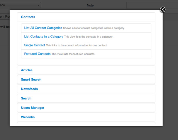
I'm yet to use this on a site that has extra extensions installed so it may be that the list of options may become less manageable as the list grows, but at this stage it seems and indeed has already proven to be a much more efficient way to select and create menu items in a Joomla site - well for me at least anyway.
blog comments powered by Disqus